Adapting Design Systems
The project is based around Massimo Vignelli's famous grid system used across the US National Park Service (NPS).
This inspired the project where I create an 8-page booklet spread for two locations under the NPS and use the same a similar grid template
to come up with my own designs based on the structured content gathered from the location-specific NPS websites.
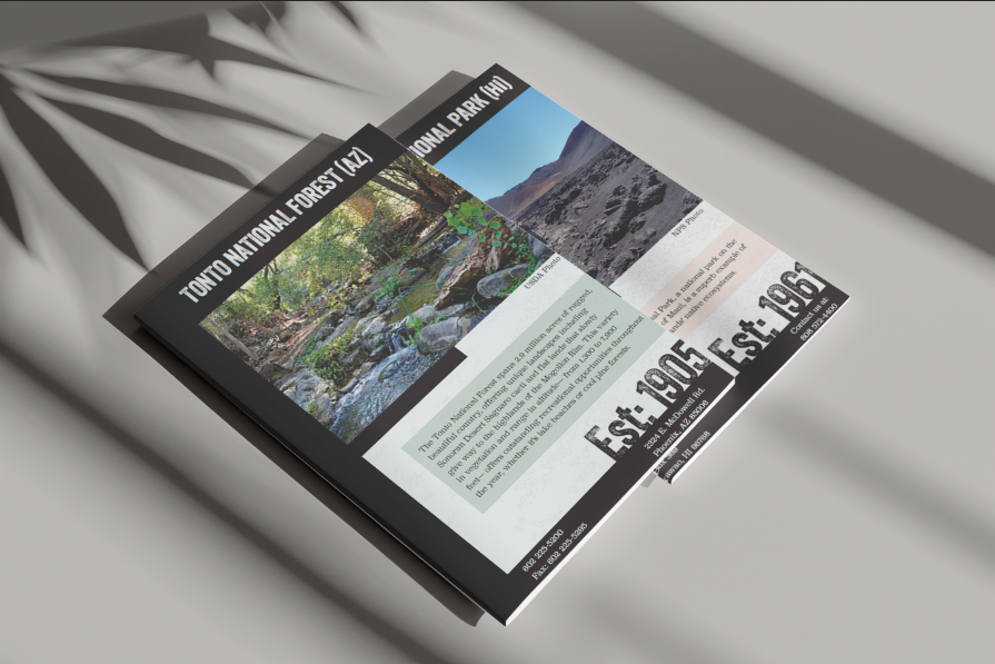
A brochure would consist of a cover page, a poster inset for the middle page of the spread and informational pages covering information about the locations.
My two locations of choice were:
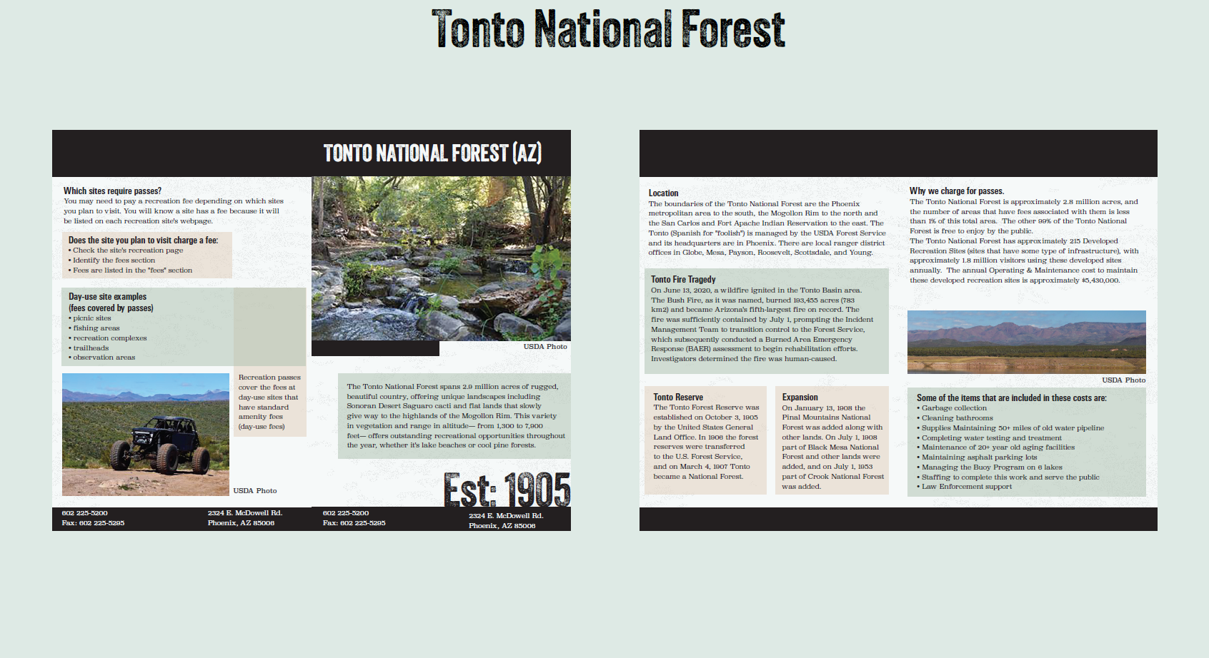
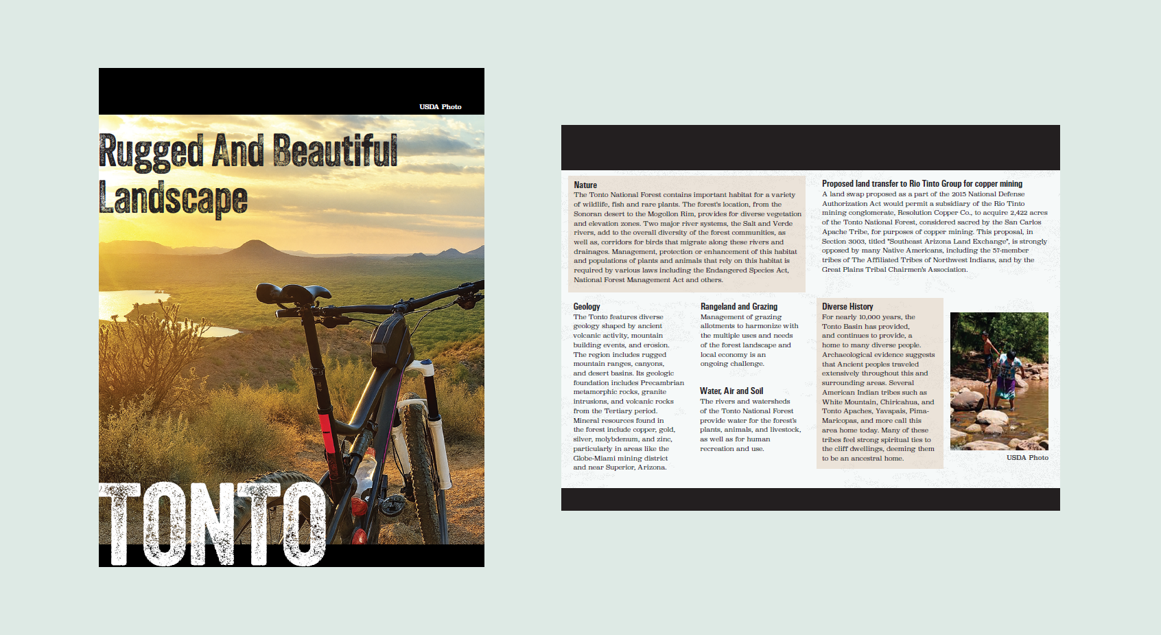
Tonto National Forest, AZ
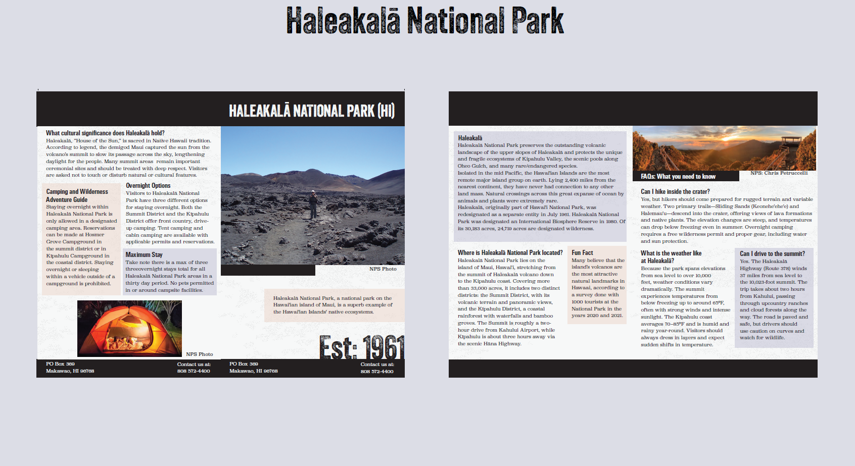
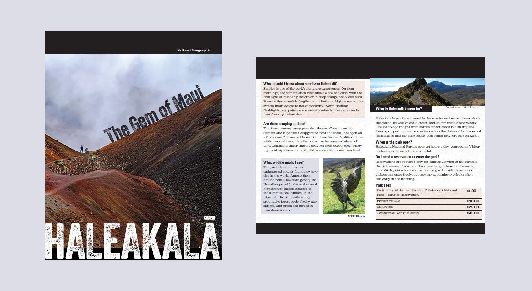
Haleakalā National Park, Maui Island, HA
Ideation
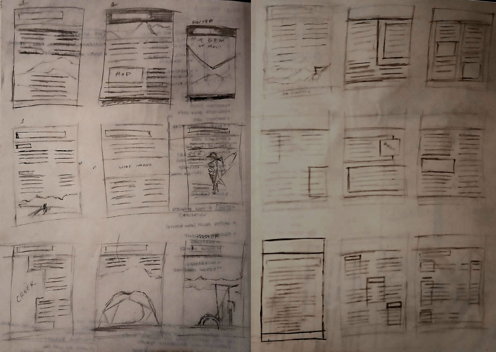
My sketching process was to serve as my guide, to offer direction and visualise what I may want to do with my overall content layoutwise. With some of the images from the websites in mind, I first tried to figure out how I could use them on the page and with text. It was during this process of experimenting with grids and layouts that I had the idea to use coloured rectangles as boxes behind text to break up large sections of content and provide cohesion throughout the design system between the two brochures.
Design System
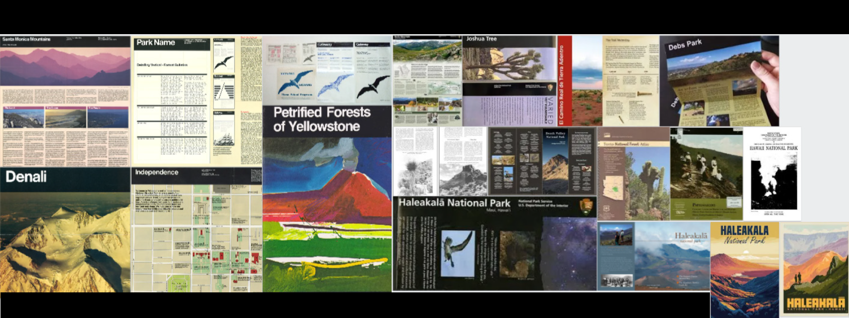
On top of the project brief and grid template provided, it felt most appropriate for the moodboard process to focus on understanding ways in which the Vignelli grid system has been utilised in the real-life National Park brochures, as well as understand what thematic elements are utilised, such as imagery, colour schemes, and general content organisation. This helped inform my decisions further in terms of trying to create a cohesive but different approach to the well-established grid system.
System Development
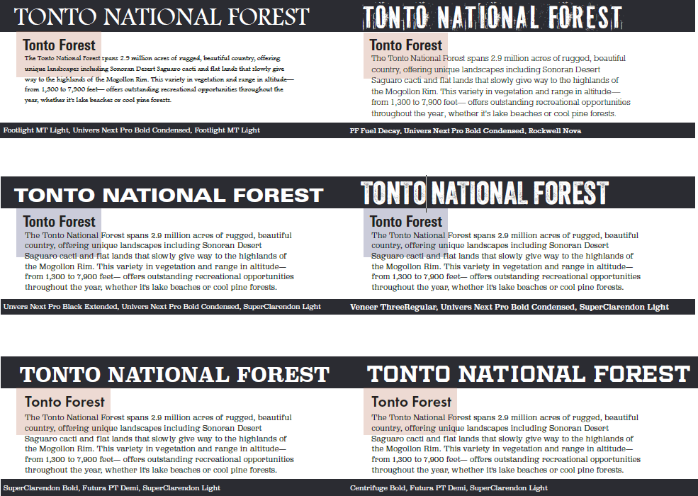
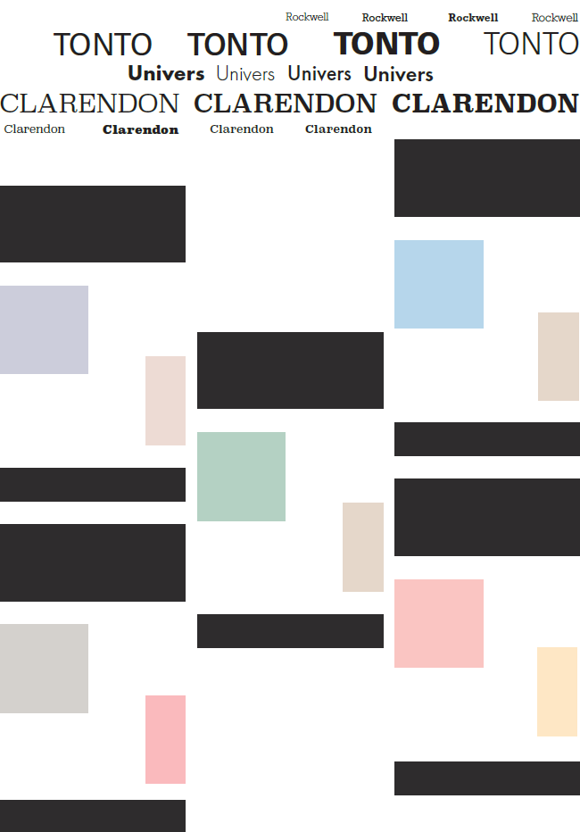
To identify the type system for the project, I focused on the atmosphere and textural theme of thelocations I selected, particularly with the display type, where I settled for the textured 'Veneer' typeface that felt unique and well integrated with the theme and in the black grid. The body text, SuperClarendon, was chosen to provide balance to the other two typefaces that had a high x-height as headings, and of the lower x-height typefaces, it felt most readable in the scenario. I also made sure to trial the typefaces with the coloured boxes to ensure they were compatible. I then trialed thecoloured boxes, experimenting with the colours for thematic fit for each of my locations. Following the inspiration for the textured display type, I experimented with a texture on the background of my pages, where, using one of the selected images (bottom right), I used the image trace feature in Illustrator to create a texture that could be effective without intefering with the foreground elements too much in terms of readability.
Poster Concepts
The Haleakala poster image was the most interesting composition-wise with the angular arrangement and the idea to align the type come naturally. Still using placeholder text, the title text was moved down to allow the image more visibility and it was made white to stand out from the dark grid.
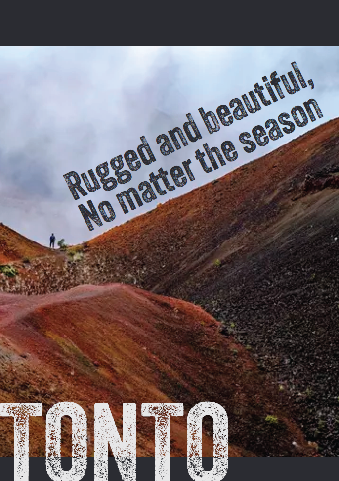
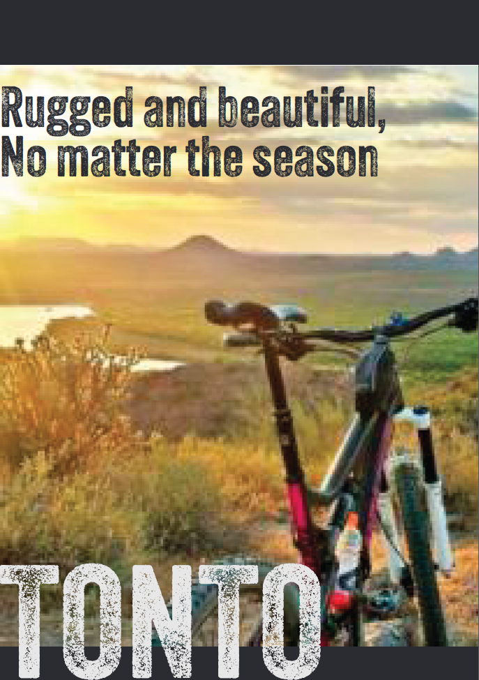
The Tonto image felt the most vivid and all-encapsulating one of the bunch, with a cinematic composition that felt exciting along with the tagline. The text layout did not need much manipulation outside of the colour changes in the title, as the composition of the image was complex enough on its own.
Final Spreads